- Sector
- Digital product · Adolescence and ADHD
- Disciplines
- Application design and visual identity
VIRA is an application conceived to support teenagers with ADHD in organising habits, tasks and emotional check-ins. The project connects product design with brand identity: screens, illustration, colour and tone are parts of the same experience.
The challenge
An application bringing together routines, tasks and emotions has to organise very different kinds of content. The design challenge was to give each function a clear place without filling screens with instructions. The tone also needed to feel appropriate for teenagers: friendly and direct, with a recognisable personality. Information hierarchy had to separate context from the next available action, particularly within the limited space of a mobile interface.
The idea
The product direction starts with micro-actions. Rather than giving every part of a routine equal weight, the interface breaks it into identifiable steps and provides feedback on an action. This logic also informs the brand. Colour, illustration and visual language create continuity between screens. Identity takes part in explaining the product and guiding navigation, connecting graphic choices with the structure of the experience rather than acting as a separate decorative layer.
The system in use
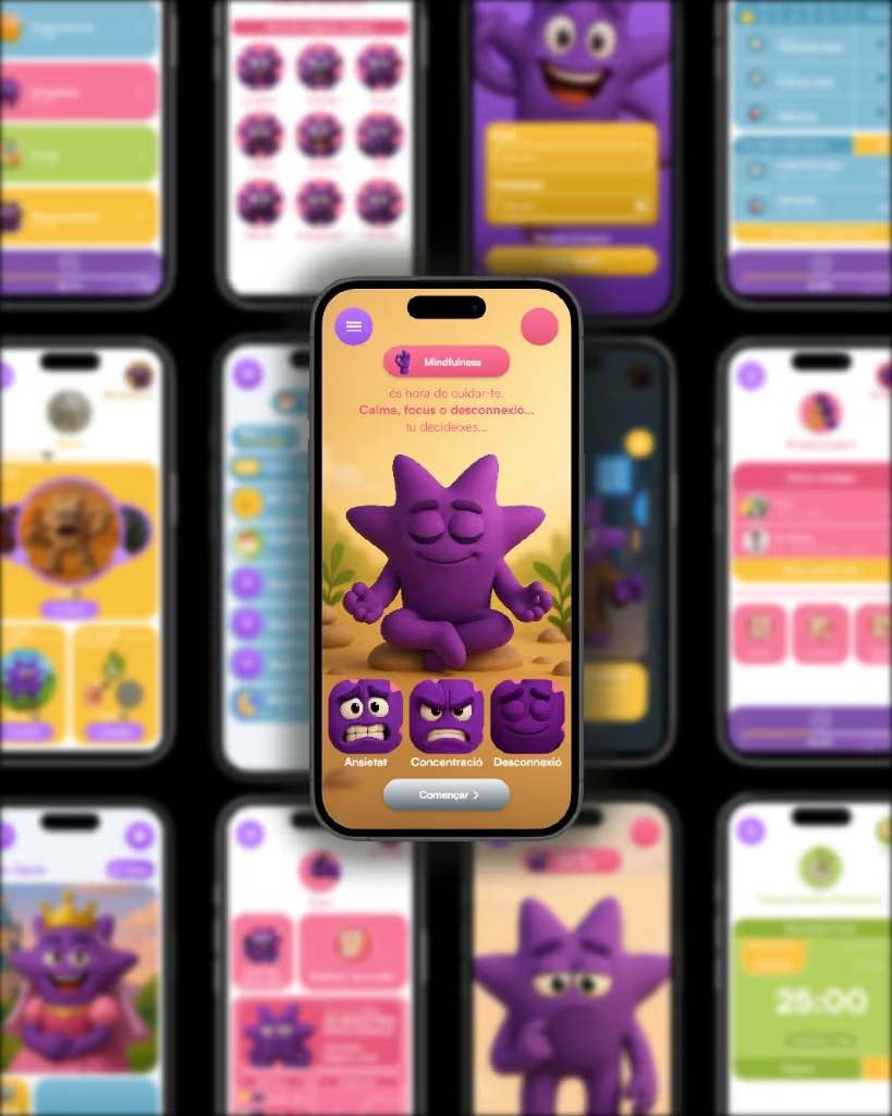
The mobile UX/UI work organises tasks, habits and emotional check-ins into short sequences. Component rules keep actions and information hierarchy consistent. The palette and illustrations establish a recognisable character across different moments of the experience. The project images show how these pieces relate: identity elements, graphic assets and screens share criteria, while each element serves a particular purpose. That connection allows the overall personality to remain present in both expressive brand material and functional interface design.
The outcome
The documented output is a connected brand and product system: visual identity, palette, illustration and mobile interface design. Together they present VIRA as a coherent experience, with a visual language supporting its content and actions. The case demonstrates how a design idea can move from brand personality to an individual screen while keeping priorities and relationships clear. The portfolio materials describe the design scope and the artefacts produced for the project.
Project scope and outputs
- Mobile UX/UI
- Visual identity
- Palette and illustration
- Visual language and component rules